Chapter 14 t-test: Comparing two means
We will cover the following:
- One-sample t-test
- Paired t-test
- Two-sample t-test (“Welch’s t-test”)
14.1 Some theory
In this theory section I focus on the one-sample t-test, but the concepts apply to the other types of t-test.
The one-sample t-test is used to compare the mean of a sample to some fixed value. For example, we might want to compare pollution levels (e.g. in mg/m3) in a sample to some acceptable threshold value to help us decide whether we need to take action to prevent or clean up pollution.
One of the assumptions of t-tests (and many other tests/models) is that the distribution of residual values in the sample of data can be described by a normal distribution. For a t-test, in practice, this means that the distribution of measured values for each group should be normal.
If this assumption is true, you can use these data to estimate the parameters of this sample’s normal distribution: the mean and standard error of the mean.
We will talk more about model assumptions later.
The mean gives an estimate of location, and the standard error of the mean (calculated as \(s/ \\sqrt{n}\), where s = standard deviation and n = sample size) gives an estimate of precision (i.e. how certain we are that the mean value is really where we think it is).
The t-test then works by comparing your estimated distribution with some fixed value. Sometimes you are asking “is my mean different from the value?”, other times you are asking “is my mean less than/greater than the value?”. This depends on the hypothesis. The default that R uses is that it tests whether the mean of your distribution is different to the fixed value, but in many cases you should be framing a directional hypothesis.
It is helpful to visualise this, so some examples of the pollution threshold test are shown in the figure below (Figure 14.1 ). The curves illustrate the estimated normal distributions that describe our estimate of the mean pollution level from some data (e.g. each curve might represent samples from different locations). We are interested in whether the mean values (the vertical dashed lines) are significantly greater than the threshold of 100mg/m3 (solid vertical black line) (this gives us a directional hypothesis).
Formally we do this by establishing two hypotheses: a null hypothesis and an alternative hypothesis. In this case, the null hypothesis is that the mean of the sample measurements is not significantly different from the threshold value we define. The alternative hypothesis is that the sample mean is significantly greater than this threshold value.
The degree of confidence that we can have that the mean pollution values are different from the threshold value depends on (A) the position of the distribution relative to the threshold value and (B) the spread of the distribution (the standard deviation/error).
Based on Figure 14.1, which of these four different samples shows a mean value significantly greater than 100? (you should be looking at the amount of the normal distribution curve that is overlapping the threshold value.)
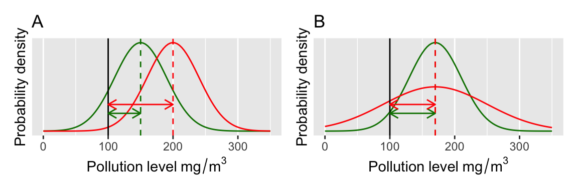
Figure 14.1: Visualisation of a t-test.
This should look familiar – it is the same concept as we used in the class on randomisation tests. If you find it confusing, please go back and review the randomisation test materials!
Another useful way to think about t-tests is that it is a way of distinguishing between signal and noise: the signal is the mean value of the thing you are measuring, and the noise is the uncertainty in that estimate. This uncertainty could be due to measurement error and/or natural variation. In fact, the t-value that the t-test relies on is a ratio between the signal (difference between mean (\(\bar{x}\)) and threshold (\(\mu_{0}\))) and noise (variability, standard error of the mean (\(s/ \sqrt{n}\))): \[t = \frac{\bar{x}-\mu_{0}} {s/ \sqrt{n}}\]
The larger the signal is compared to the noise, the higher the t-value will be. e.g. a t-value of 2 means that the signal was 2 times the variability in the data. A t-value of zero, or close to zero, means that the signal is “drowned out” by the noise. Therefore, high t-values give you more confidence that the difference is true.
To know if the t-value means that the difference is significant, the t-value is compared to a known theoretical distribution (the t-distribution). The area under the curve of the distribution is 1, but its shape depends on the degrees of freedom (i.e. sample size - 1). The plot below (Figure 14.2) shows three t-distributions of different degrees of freedom (d.f.).
What R is doing when it figures out the p-value is calculating the area under the curve beyond the positive/negative values of the t-statistic. If t is small, then this value is large (p-value). If t is large then the area (and the p-value) is small. In the olden-days (>15 years ago) you would have looked these values up in printed tables, but now R does that for us.
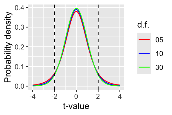
Figure 14.2: The t-distribution
14.2 One sample t-test
Enough theory. Here’s how you would apply such a test in R.
Remember to load the dplyr, magrittr and
ggplot packages, and to set your working directory
correctly.
Firstly, lets load some data. Because this is a very small example, you can simply cut and paste the data in rather than loading it from a CSV file.
pollution <- data.frame(mgm3 = c(
  105, 196, 226, 81, 156, 201, 142, 149, 191, 192,
  178, 185, 231, 76, 207, 138, 146, 175, 114, 155
))
First I plot the data (Figure 14.3). One reason for doing this is to check that the data look approximately normally distributed. These data are slightly left-skewed but they are close enough.
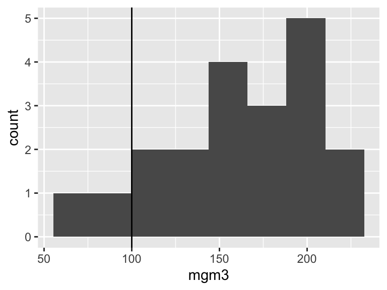
Figure 14.3: Histogram of the pollution data.
Now we can run a t-test in R like this. The command is simple - the first two arguments are the data (x) and the fixed value you are comparing the data to. The final argument defines the alternative hypothesis. This can take values of “two.sided”, “less” or “greater” (the default is two.sided). In this example, the alternative hypothesis is that the mean of our sample is greater than the threshold of 100.
##
##  One Sample t-test
##
## data:  pollution$mgm3
## t = 6.2824, df = 19, p-value = 2.478e-06
## alternative hypothesis: true mean is greater than 100
## 95 percent confidence interval:
##  145.0803      Inf
## sample estimates:
## mean of x
##     162.2
The output of the model tells us (1) what type of t-test is being fitted (“One Sample t-test”). Then it gives some values for the t-statistic, the degrees of freedom and the p-value. The model output also tells us that the alternative hypothesis “true mean is greater than 100”. Because the p-value is very small (p<0.05) we can reject the null hypothesis and accept the alternative hypothesis. Finally, the output gives you the confidence interval (the area where we strongly believe the true mean to lie) and the estimate of the mean.
We could report these results like this: “the mean value of the sample was 162.2 mg/m3, which is significantly greater than the acceptable threshold of 100 mg/m3 (t-test: t = 6.2824, df = 19, p-value = 2.478e-06).
14.3 Doing it “by hand” - where does the t-statistic come from?
At this point, to ensure that you understand where the t-statistic comes from we will calculate the t-statistic using the equation from above. The purpose of this is to illustrate that this is not brain surgery - it all hinges on a straightforward comparison between signal (the difference between mean and threshold in this case) and noise (the variation, or standard error of the mean).
To do this we first need to know the mean value and the threshold (the signal: \(\bar{x} - \mu_{0}\)). We can then divide that by the standard error of the mean (the noise: \(s/ \sqrt{n}\))
Here goes… I first create a vector (x) of the values to save typing. Then I show how to calculate mean and standard error, before dividing the “signal” by the “noise”.
## [1] 162.2## [1] 9.900718## [1] 6.282373This matches exactly with the t-statistic above!
One can obtain a p-value from a given t-statistic and degrees of freedom like this for a t-test like the one fitted above (the d.f. is the sample size minus one for a one-sample t-test):
## [1] 2.477945e-06Again, this matches the value from the t.test function above.
14.4 Paired t-test
It’s actually quite hard to find examples of one-sample t-tests in biology. In most cases, the one-sample t-tests are really paired t-tests, which are a special case of the one sample test where rather than using the actual values measured, we use the difference between them instead (Figure 14.4).
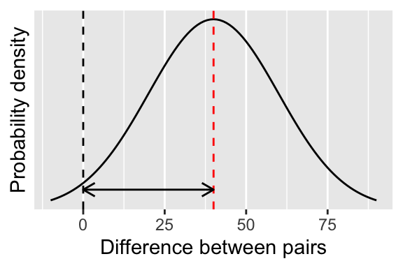
Figure 14.4: Visualising a paired t-test.
Here’s a simple example. Anthropologists studied tool use in women from the indigenous Machinguenga of Peru7. They estimated the amount of cassava obtained in kg/hour using either a wooden tool (a broken bow) or a metal machete. The study focused on 5 women who were randomly assigned to groups to use the wooden tool then the machete (or vice versa).
The anthropologists hypothesised that using different tools led to different harvesting efficiency. The null hypothesis is that there is no difference between the two groups and that a woman was equally efficient at foraging using either tool. The alternative hypothesis was that there is a difference between the two tools. (NOTE - this could also be formulated as a directional hypothesis e.g. with the expectation that machete is more efficient than the bow.)
First let’s import and look at the data. Make sure you understand it. A plot will be fairly useless to tell if the data are normally distributed, so we will simply have to assume that they are. In fact, t-tests are famously robust to non-normality.
##    subjectID    tool amount
## 1          1 machete    119
## 2          1     bow     39
## 3          2 machete    216
## 4          2     bow    114
## 5          3 machete    240
## 6          3     bow    150
## 7          4 machete    129
## 8          4     bow     51
## 9          5 machete    137
## 10         5     bow     60
We should now plot our data (Figure 14.5). A nice way of doing this for paired data is to plot points with lines joining the pairs. This way, the slope of the lines is a striking visual indication of the effect.
ggplot(toolUse, aes(x = tool, y = amount, group = subjectID)) +
  geom_line() +
  geom_point() +
  xlab("Tool used") +
  ylab("Casava harvested (kg/hr)")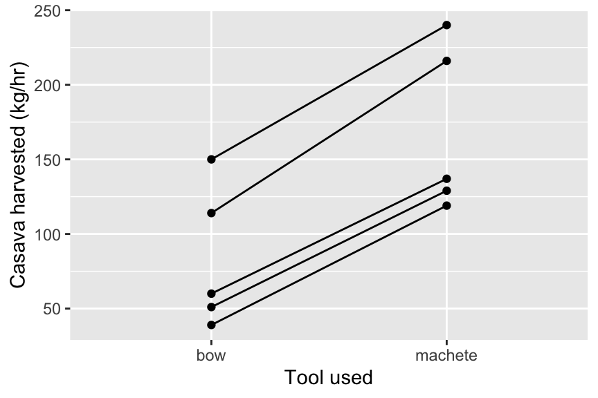
Figure 14.5: An interaction plot for the tool use data
We can also look at the mean values and standard deviations:
## # A tibble: 2 × 3
##   tool    meanAmount sdAmount
##   <chr>        <dbl>    <dbl>
## 1 bow           82.8     47.3
## 2 machete      168.      55.6
Now lets do a paired t-test to compare the means using the two tools. The best way to do this is to provide the two samples separately in the t.test command. To do this you will need to create two vectors containing the data from the two groups like this, using the dplyr command pull to extract the variable along with filter to subset the data.
IMPORTANT: it is very important that the pairs are arranged in the data frame so that the pairs match up when you filter the data to each group. It is therefore advisable to use arrange to sort the data by first the pairing variable (in this case, subjectID), and then the explanatory variable (the variable that defines the group - in this case, tool.
toolUse <- toolUse %>%
  arrange(subjectID, tool)

A <- toolUse %>%
  filter(tool == "machete") %>%
  pull(amount)

B <- toolUse %>%
  filter(tool == "bow") %>%
  pull(amount)

t.test(A, B, paired = TRUE)
##
## Paired t-test
##
## data: A and B
## t = 17.98, df = 4, p-value = 5.625e-05
## alternative hypothesis: true mean difference is not equal to 0
## 95 percent confidence interval:
## 72.21262 98.58738
## sample estimates:
## mean difference
## 85.4You would report these results something like this: “Women harvested cassava more efficiently with a machete (168.2 kg/hr) than with a wooden tool (82.8kg/hr). The difference of 85.4 kg/hr (95% CI 72.2-98.6 kg) was statistically significant (paired t-test: t = 17.98, df = 4, p-value = 5.625e-05).”
NOTE: you could add the argument alternative = "less" or greater to these t-tests to turn them into directional one-tailed hypotheses. However, you should also be aware that the p-value for a one-tailed t-test is always half that of the two-tailed test. Therefore, you could also simply half the p-value when you report it rather than adding the “alternative” argument.
14.5 A paired t-test is a one-sample test.
A paired t-test is the same as a one-sample t-test really. Here’s proof.
First we need to calculate the difference between the two measures
Then we can fit the one-sample t-test from above, with the mu set as 0 (because the null hypothesis is that there is no difference between the groups). Compare this result with the paired t-test above.
##
##  One Sample t-test
##
## data:  difference
## t = 17.98, df = 4, p-value = 5.625e-05
## alternative hypothesis: true mean is not equal to 0
## 95 percent confidence interval:
##  72.21262 98.58738
## sample estimates:
## mean of x
##      85.4
14.6 Two sample t-test
The two sample t-test is used for comparing the means of two samples [no shit!? :)]
You can visualise this by picturing your two distributions (Figure 14.6) and thinking about their overlap. If they overlap a lot the difference between means will not be significant. If they don’t overlap very much then the difference between means will be significant.
The underlying mathematical machinery for the two-sample t-test is similar to the one-sample and paired t-tests. Again, the important value is the t-statistic, which can be thought of as a measure of signal:noise ratio (see above). It is harder to detect a signal (the true difference between means) if there is a lot of noise (the variability, or spread of the distributions), or if the signal is small (the difference between means is small).
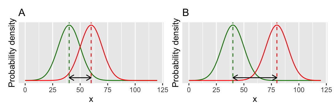
Figure 14.6: A two-sample t-test.
The mathematics involved with calculating the t-statistic is very similar to the one-sample t-test, except the numerator in the fraction is the difference between two means rather than between a mean and a fixed value. The denominator is the standard error of the difference between the two means, which combines the variability of both groups:
\[t = \frac{\bar{x_1}-\bar{x_2}} {\sqrt{\frac{s_1^2}{n_1} + \frac{s_2^2}{n_2}}}\] So far so good… let’s push on and use R to do some statistics.
In this example, we can revisit the class data — a set of measurements (height, hand width, reaction time, and so on) collected from students in previous years of this course — and ask the question, Is the reaction time of males different than that of females? The null hypothesis for this question is that there is no difference in mean reaction times between the two groups. The alternative hypothesis is that there is a difference in the mean reaction time between the two groups.
Import the data in the usual way, and subset it to the right year (in the example below I am using 2019 data).
x <- read.csv("CourseData/classData.csv") %>%
  filter(Year == 2019) %>%
  filter(Gender %in% c("Male", "Female"))
Then look at the data. Here I do this using a box plot with jittered points (a nice way of plotting data with small sample sizes) (Figure 14.7). From this figure, it looks like males have a faster reaction time than females, but there is a lot of variation. We need to apply the t-test in a similar way to above.
ggplot(x, aes(x = Gender, y = Reaction)) +
  geom_boxplot() +
  geom_jitter(col = "grey60", width = 0.2)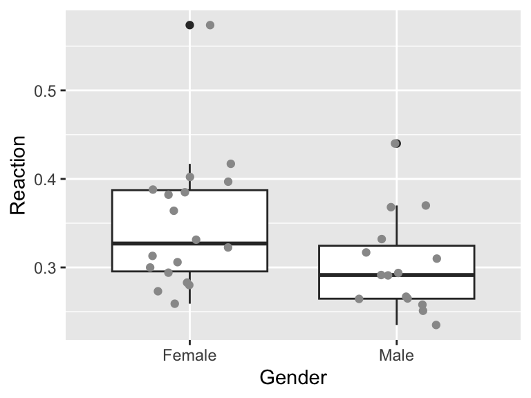
Figure 14.7: Reaction time of both sexes
##
##  Welch Two Sample t-test
##
## data:  Reaction by Gender
## t = 1.9655, df = 30.528, p-value = 0.05851
## alternative hypothesis: true difference in means between group Female and group Male is not equal to 0
## 95 percent confidence interval:
##  -0.001716093  0.091311649
## sample estimates:
## mean in group Female   mean in group Male
##            0.3483778            0.3035800
This output first tells us that we are using something called a “Welch Two Sample t-test”. This is a form of the two-sample t-test that relaxes the assumption that the variance in the two groups is the same. This is a good thing. Although it is possible to fit a t-test with equal variances, I recommend that you stick with the default Welch’s test and not make this limiting assumption.
Then we are told the t-statistic (1.965), the degrees of freedom (30.528) and the p-value (0.059). We must therefore fail to reject the null hypothesis: there is no detectable difference between the two groups. We have not shown that males are faster than females. We could report this something like this:
“Although females had a slightly slower reaction time than males (0.348 seconds compared to 0.304 seconds), this difference was not statistically significant (Welch’s t-test: t= 1.965, d.f.= 30.528), p=0.059).”
Note: With a t-test that did assume equal variances in the two groups, the d.f. is calculated as the sample size - 2 (the number of groups). You can do this by adding the argument “var.equal = TRUE” to the t-test command. With the Welch test, the appropriate degrees of freedom are estimated by looking at the sample sizes and variances in the two groups. The details of this are beyond the scope of this course.
14.7 t-tests are linear models
It is also possible to formulate t-tests as linear models (using the lm function). To do this with the paired t-test you would specify a model that estimates an intercept. In R you can do this by writing the formula as x ~ 1. So, for the tool use example you can write the code like this:
##
## Call:
## lm(formula = difference ~ 1)
##
## Residuals:
##    1    2    3    4    5
## -5.4 16.6  4.6 -7.4 -8.4
##
## Coefficients:
##             Estimate Std. Error t value Pr(>|t|)
## (Intercept)    85.40       4.75   17.98 5.62e-05 ***
## ---
## Signif. codes:  0 '***' 0.001 '**' 0.01 '*' 0.05 '.' 0.1 ' ' 1
##
## Residual standard error: 10.62 on 4 degrees of freedom
If you look at the summary will notice that the estimate of the intercept (the average difference between the two pairs), the degrees of freedom and the t-value and the p-value are all the same as the value reported when using t.test.
In fact, all of the t-tests, and ANOVA (below) are kinds linear models and can be also fitted with lm.
Here is the two-sample t-test investigating gender differences in reaction time. You can see that the test statistics and coefficients match those obtained from t.test.
## Analysis of Variance Table
##
## Response: Reaction
##           Df  Sum Sq   Mean Sq F value  Pr(>F)
## Gender     1 0.01642 0.0164196  3.6482 0.06542 .
## Residuals 31 0.13952 0.0045008
## ---
## Signif. codes: 0 '***' 0.001 '**' 0.01 '*' 0.05 '.' 0.1 ' ' 1##
## Call:
## lm(formula = Reaction ~ Gender, data = x)
##
## Residuals:
## Min 1Q Median 3Q Max
## -0.08938 -0.04558 -0.01258 0.03662 0.22542
##
## Coefficients:
## Estimate Std. Error t value Pr(>|t|)
## (Intercept) 0.34838 0.01581 22.03 <2e-16 ***
## GenderMale -0.04480 0.02345 -1.91 0.0654 .
## ---
## Signif. codes: 0 '***' 0.001 '**' 0.01 '*' 0.05 '.' 0.1 ' ' 1
##
## Residual standard error: 0.06709 on 31 degrees of freedom
## Multiple R-squared: 0.1053, Adjusted R-squared: 0.07643
## F-statistic: 3.648 on 1 and 31 DF, p-value: 0.0654214.8 Exercise: Sex differences in fine motor skills
Some people have suggested that there might be sex differences in fine motor skills in humans. Use the data collected from students in previous years to address this topic using t-tests. The relevant data set is called classData.csv, and the columns of interest are Gender and Precision.
Carry out a two-sample t-test.
Plot the data (e.g. with a box plot, or histogram)
Formulate null and alternative hypotheses.
Use the
t.testfunction to do the test.Write a sentence or two describing the results.
14.9 Exercise: Therapy for anorexia
A study was carried out looking at the effect of cognitive behavioural therapy on weight of people with anorexia. Weight was measured in week 1 and again in week 8. Use a paired t-test to assess whether the treatment is effective.
The data is called anorexiaCBT.csv
The data are in “wide format”. You may wish to convert it to “long format” depending on how you use the data. You can do that with the pivot_longer function, which rearranges the data:
anorexiaCBT_long <- anorexiaCBT %>%
  pivot_longer(
    cols = starts_with("Week"), names_to = "time",
    values_to = "weight"
  )
Plot the data (e.g. with an interaction plot).
Formulate a null and alternative hypothesis.
Use
t.testto conduct a paired t-test.Write a couple of sentences to report your result.
14.10 Exercise: Compare t-tests with randomisation tests (optional)
-
Try re-analysing some of the tests in this chapter as randomisation tests (or analyse the randomisation test data using
t.test). Do they give the same results? -
Try answering the question - “are people who prefer dogs taller than those who prefer cats?” using the
classData.csv. Can you think of any problems with this analysis?
A.M. Hurtado, K. Hill (1989). “Experimental Studies of Tool Efficiency Among Machinguenga Women and Implications for Root-Digging Foragers”, Journal of Anthropological Research, Vol.45,2,pp207-217.↩︎