Chapter 12 Randomisation Tests
When conducting simple experiments to compare mean values between two groups, the null hypothesis typically assumes no difference between the groups. The alternative hypothesis can vary. Sometimes it simply states that the two groups are different, without specifying the direction of the difference. In other cases, it asserts that the mean of Group A is either less than or greater than the mean of Group B.
Randomisation tests provide an intuitive approach to testing these hypotheses, although they can be computationally intensive. These tests have a long history and were initially proposed by R.A. Fisher in the 1930s. They only became widely practical with the advent of high-speed computers capable of performing the necessary calculations.
To conduct a randomisation test using R, you will have the opportunity to put your dplyr skills to the test. In the following example, you will be guided through the process step by step, gaining a better understanding of how randomisation tests work and how they can be applied to biological research.
12.1 Randomisation test in R
A new drug has been developed that is supposed to reduce cholesterol levels in men. An experiment has been carried out where 12 human test subjects have been assigned randomly to two groups: “Control” and “Drug”. The pharmaceutical company is hoping that the “Drug” group will have lower cholesterol than the “Control” group. The aim here is to do a randomisation test to check that.
Remember to load the dplyr, magrittr and
ggplot packages, and to set your working directory
correctly.
Import the data, called cholesterol.csv.
Let’s first take a look at the data by plotting it. I will plot a boxplot and add jittered points for clarity.
ggplot(ch, aes(x = Treatment, y = Cholesterol)) +
  geom_boxplot() +
  geom_jitter(colour = "grey", width = .1)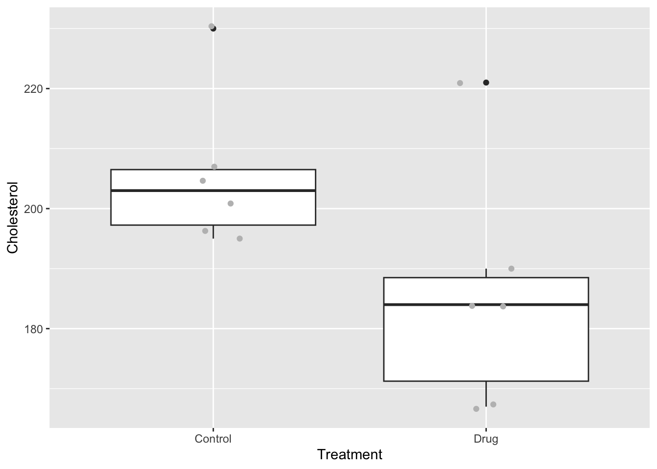
It looks like there might be a difference between the groups. Now let’s consider our test statistic and our hypotheses. Our test statistic is the difference in mean cholesterol levels between the two groups: mean of the control group minus the mean of the drug group.
The null hypothesis is that there is no difference between these two groups (i.e. the difference should be close to 0).
The alternative hypothesis is that the mean of the drug group should be less than the mean of the control group.
12.1.1 Calculate the observed difference
There are a few ways of doing this. In base R you can use the function tapply (“table apply”), followed by diff (“difference”).
##  Control     Drug
## 205.6667 185.5000## Drug
## -20.16667Because we are focusing on learning dplyr, you can also calculate the means like this:
ch %>% # ch is the cholesterol data
  group_by(Treatment) %>% # group the data by treatment
  summarise(mean = mean(Cholesterol)) # calculate means
## # A tibble: 2 × 2
## Treatment mean
## <chr> <dbl>
## 1 Control 206.
## 2 Drug 186.Here the pipes (%>%) pass the result of each function on as input to the next.
You can use further commands, pull to get the mean vector from the summary table, and then use diff to calculate the difference between the groups, before assigning that to observedDiff.
observedDiff <- ch %>%
  group_by(Treatment) %>% # group the data by treatment
  summarise(mean = mean(Cholesterol)) %>% # calculate means
  pull(mean) %>% # extract the mean vector
  diff()
This is a complicated set of commands. To make sure you understand it, try running it bit by bit to see what is going on.
12.1.2 Null distribution
Now we ask, what would the world look like if our null hypothesis was true? To do this we can disassociate the treatment group variable from the measured cholesterol values. We do this by using the mutate function to replace the Treatment variable with a shuffled version of itself using the sample function.
Let’s try that one time:
ch %>%
  mutate(Treatment = sample(Treatment)) %>%
  # shuffle the Treatment data
  group_by(Treatment) %>%
  summarise(mean = mean(Cholesterol)) %>%
  pull(mean) %>%
  diff()
## [1] -10.16667In this instance, the difference with the shuffled Treatment values of -10.167 is rather different from our observed difference of -20.167.
Doing this one time is not much help though - we need to repeat this many times. I suggest that you do it 1000 times here, but some statisticians would suggest 5000 or even 10000 replicates.
We can do this easily in R using the function replicate, which is a kind of wrapper that tells R to repeat a command n times and then pass the result to a vector.
Let’s try it first 10 times to see how it works:
replicate(
  10,
  ch %>%
    mutate(Treatment = sample(Treatment)) %>%
    group_by(Treatment) %>%
    summarise(mean = mean(Cholesterol)) %>%
    pull(mean) %>%
    diff()
)
## [1] 11.500000 -6.500000 -19.166667 -1.833333 -7.833333 21.166667
## [7] -11.500000 -21.833333 28.833333 -5.833333You can see that the replicate command simply does the sampling-recalculation of the mean 10 times.
In the commands below I create 1000 replicates of the shuffled differences. I want to put them in a dataframe to make it easy to plot. Therefore, I first create a data.frame called shuffledData. This data frame initially has a variable called rep which consists of the numbers 1-1000. I then use mutate to add the 1000 shuffled differences.
shuffledData <- data.frame(rep = 1:1000) %>%
  mutate(shuffledDiffs = replicate(
    1000,
    ch %>%
      mutate(Treatment = sample(Treatment)) %>%
      group_by(Treatment) %>%
      summarise(mean = mean(Cholesterol)) %>%
      pull(mean) %>%
      diff()
  ))
When you use summarise, R will give you a message like
this:
summarise() ungrouping output (override with .groups argument)
This can be annoying, particularly if you are using randomisation
tests and summarising hundreds of times. Thankfully, you can turn off
this behaviour by setting one of the dplyr options like
this:
options(dplyr.summarise.inform = FALSE)
I suggest to put this code at the beginning of your script if the messages annoy you!
12.1.3 Testing significance
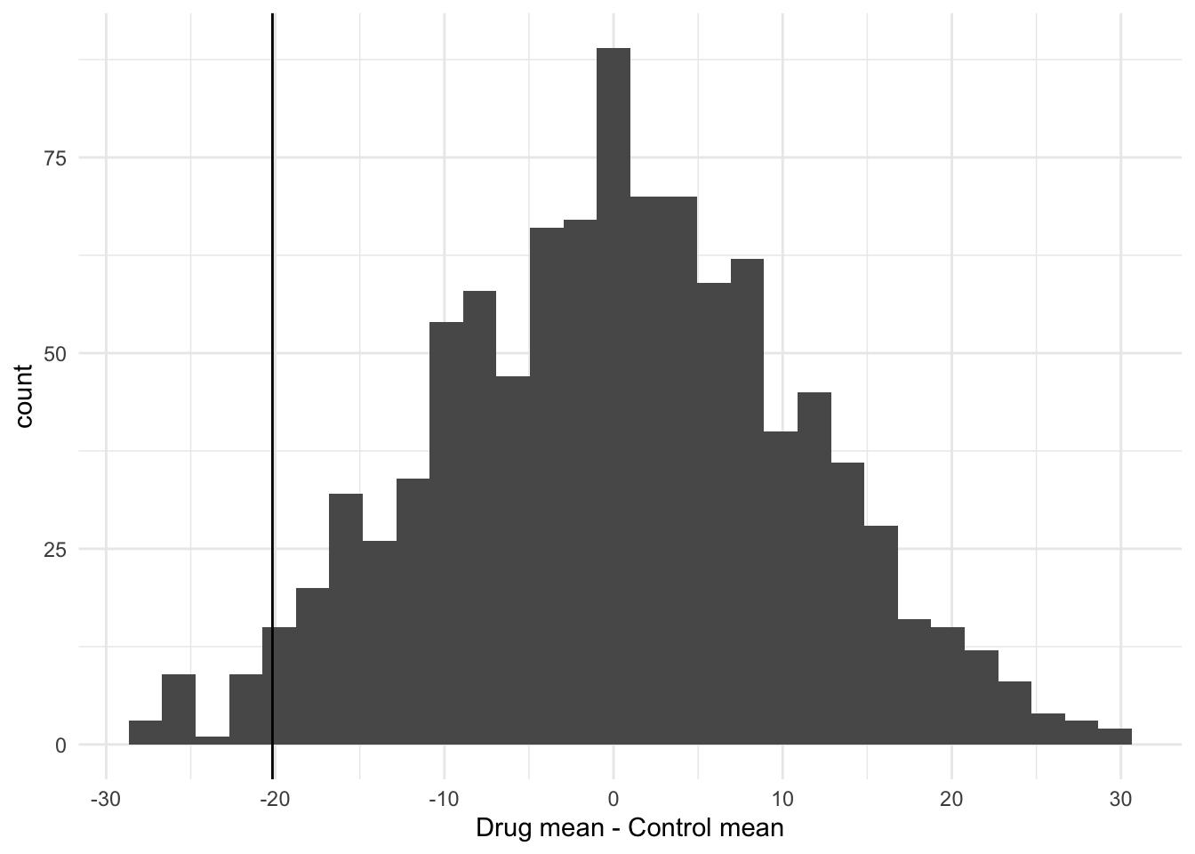
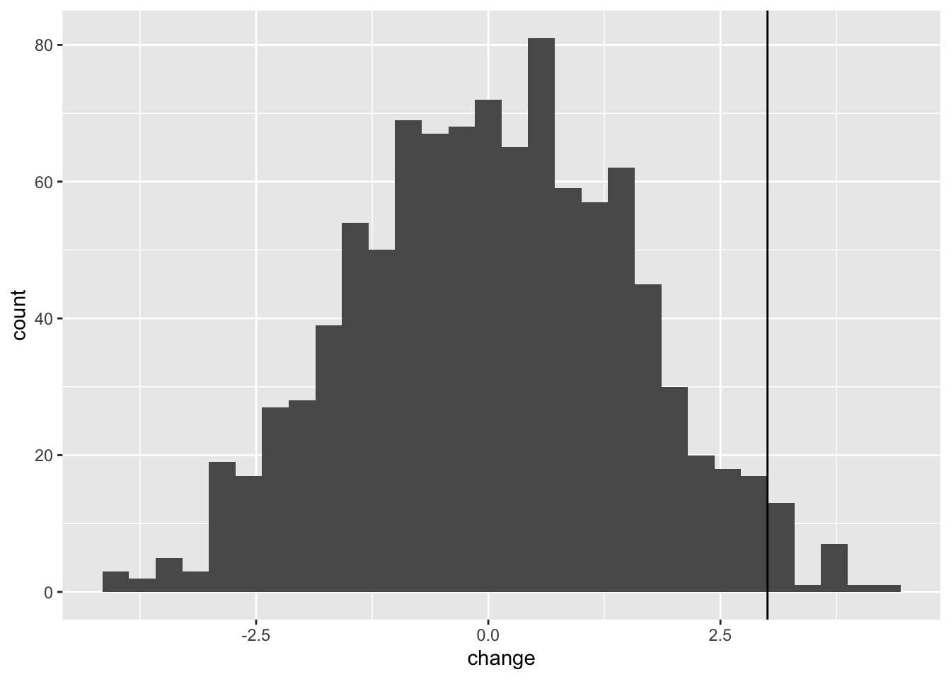
Before formally testing the hypothesis it is useful to visualise what we have created in a histogram. I can use ggplot to do this, to create a plot called p1. Note that by putting the command in brackets R will both create the plot object, and print it to the screen. Note that because the shuffling of the data is random process your graph will look slightly different to mine.
(p1 <- ggplot(shuffledData, aes(x = shuffledDiffs)) +
  geom_histogram() +
  theme_minimal() +
  xlab("Drug mean - Control mean"))
You can now add your observed difference (calculated above) to this plot like this:
12.1.4 Testing the hypothesis
Recall that the alternative hypothesis is that the observed difference (control mean-drug mean) will be less than 0.
You can see that there are few of the null distribution sample that are as extreme as the observed difference. To calculate a p-value we can simply count these values and express them as a proportion. Note that because the shuffling of the data is random process your result will probably be slightly different to mine.
##
## FALSE  TRUE
##   977    23
So that is 23 of the shuffled values that are equal to or less than the observed difference. The p-value is then simply 23/1000 = 0.023.
Therefore we can say that the drug appears to be effective at reducing cholesterol.
12.1.5 Writing it up
We can report our findings something like this:
“To test whether effect of the drug at reducing cholesterol level is statistically significant I did a 1000 replicate randomisation test with the null hypothesis being that there is no difference between the group means and the alternative hypothesis that the mean for the drug treatment is lower than the control treatment. I compared the observed difference to this null distribution to calculate a p-value in a one-sided test.
The observed mean values of the control and treatment groups 205.667 and 185.500 respectively and the difference between them is therefore r-20.167 (drug mean - control mean). Only 25 of the 1000 null distribution replicates were as low or lower than my observed difference value. I conclude that the observed difference between the means of the two treatment groups is statistically significant (p = 0.025)”
12.2 Paired Randomisation Tests
A paired randomisation test is used when the observations in your data are paired or matched in some way. In this type of test, each observation in one group (e.g. Group A) is paired or matched with a corresponding observation in the other group (e.g. Group B), based on some relevant characteristic or factor.
You would use a paired randomisation test when you want to compare the mean values of the two groups while taking into account the paired nature of the observations. This type of test is particularly useful when the paired observations are expected to be more similar to each other than to the observations in the other group.
Here are three examples of situations where a paired randomisation test would be appropriate:
Pre- and post-treatment measurements: Suppose you are conducting a study to evaluate the effectiveness of a new drug. You measure a specific outcome variable in each participant before and after administering the treatment.
Left-right comparisons: Imagine you are studying the effect of a certain intervention on the strength of participants’ dominant and non-dominant hands. Each participant’s hand strength is measured twice, once for the dominant hand and once for the non-dominant hand.
Matched case-control studies: In a case-control study design, where individuals with a particular condition (cases) are compared to individuals without the condition (controls), it is common to match cases and controls based on certain characteristics such as age, gender, or socioeconomic status. The idea is that the pairs (case vs. control) are similar in every way EXCEPT the condition being investigated.
The paired randomisation test is a one-sample randomisation test where the distribution is tested against a value of 0 (i.e. where there is no difference between the two groups). Usually this distribution is the difference in measurements between two sets of measurements taken from the pairs. For example, measurements taken from the same individuals before and after some treatment has been applied.
I will illustrate this with an example from Everitt (1994) who looked at using cognitive behaviour therapy as a treatment for anorexia. Everitt collected data on weights of people before and after therapy. These data are in the file anorexiaCBT.csv
# Remember to set your working directory first
an <- read.csv("CourseData/anorexiaCBT.csv")
head(an)
## Subject Week01 Week08
## 1 1 80.5 82.2
## 2 2 84.9 85.6
## 3 3 81.5 81.4
## 4 4 82.6 81.9
## 5 5 79.9 76.4
## 6 6 88.7 103.6These data are arranged in a so-called “wide” format. To make plotting and analysis data need to be rearranged into a tidy “long” format so that each observation is on a row. We can do this using the pivot_longer function:
an <- an %>%
  pivot_longer(
    cols = starts_with("Week"), names_to = "time",
    values_to = "weight"
  )
head(an)
## # A tibble: 6 × 3
## Subject time weight
## <int> <chr> <dbl>
## 1 1 Week01 80.5
## 2 1 Week08 82.2
## 3 2 Week01 84.9
## 4 2 Week08 85.6
## 5 3 Week01 81.5
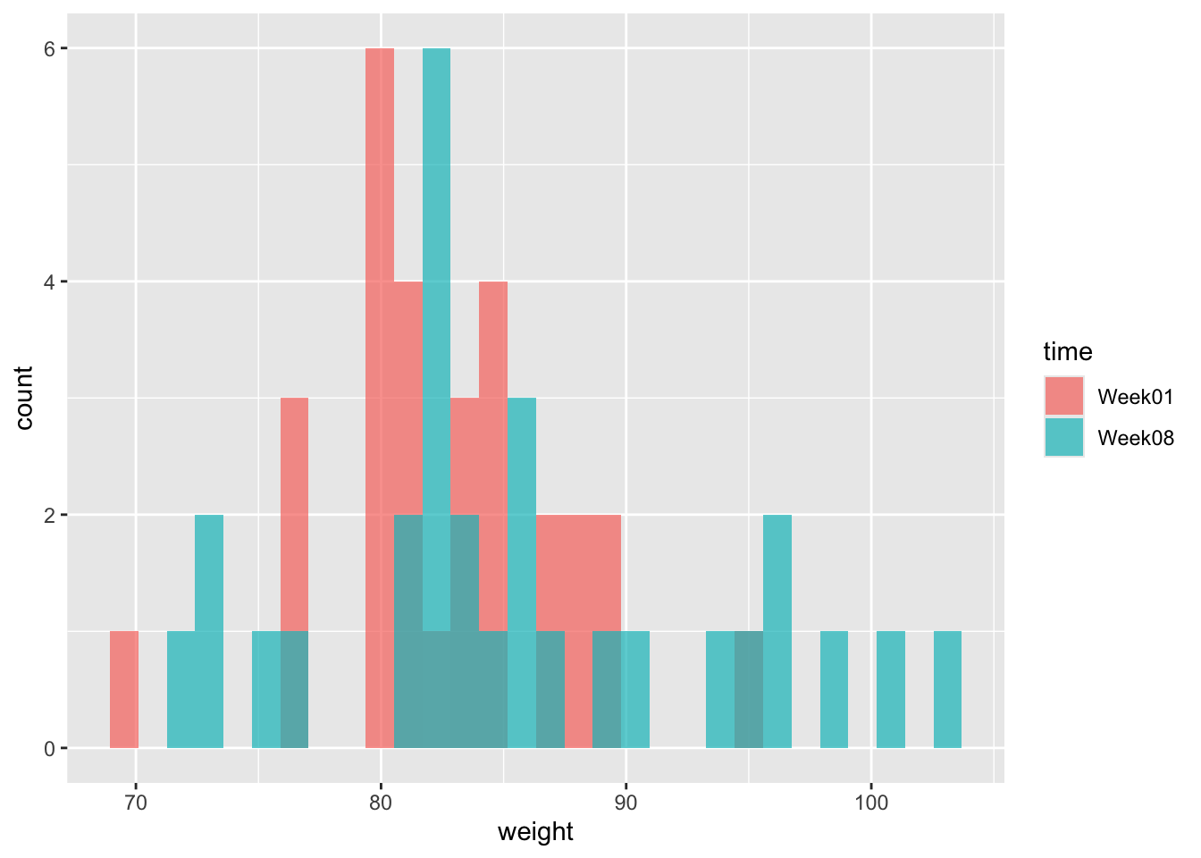
## 6 3 Week08 81.4We should always plot the data. So here goes.
(p1 <- ggplot(an, aes(x = weight, fill = time)) +
  geom_histogram(position = "identity", alpha = .7)
)
Another useful way to plot this data is to use an interaction plot. In these plots the matched pairs (grouped by Subject) are joined together with lines. You can plot one like this:
(p2 <- ggplot(an, aes(x = time, y = weight, group = Subject)) +
  geom_point() +
  geom_line(linewidth = 1, alpha = 0.5)
)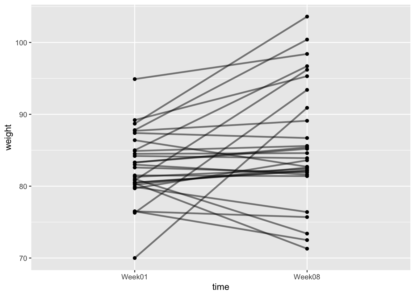
What we are interested in is whether there has been a change in weight of the subjects after CBT. The null hypothesis is that there is zero change in weight. The alternative hypothesis is that weight has increased.
The starting point for the analysis is to calculate the observed change in weight.
You have created a dataset that looks like this:
## # A tibble: 6 × 2
##   Subject change
##     <int>  <dbl>
## 1       1  1.70
## 2       2  0.700
## 3       3 -0.100
## 4       4 -0.700
## 5       5 -3.5
## 6       6 14.9
And you can calculate the observed change like this:
## [1] 3.00689712.2.1 The randomisation test
The logic of this test is that if the experimental treatment has no effect on weight, then the Before weight is just as likely to be larger than the After weight as it is to be smaller.
Therefore, to carry out this test, we can permute the SIGN of the change in weight (i.e. we randomly flip values from positive to negative and vice versa). We can do this by multiplying by 1 or -1, randomly.
## # A tibble: 6 × 2
##   Subject change
##     <int>  <dbl>
## 1       1  1.70
## 2       2  0.700
## 3       3 -0.100
## 4       4 -0.700
## 5       5 -3.5
## 6       6 14.9
anShuffled <- an %>%
mutate(sign = sample(c(1, -1),
size = nrow(an),
replace = TRUE
)) %>%
mutate(shuffledChange = change * sign)Let’s take a look at this new shuffled dataset:
## # A tibble: 6 × 4
##   Subject change  sign shuffledChange
##     <int>  <dbl> <dbl>          <dbl>
## 1       1  1.70      1          1.70
## 2       2  0.700     1          0.700
## 3       3 -0.100     1         -0.100
## 4       4 -0.700    -1          0.700
## 5       5 -3.5       1         -3.5
## 6       6 14.9      -1        -14.9
We need to calculate the mean of this shuffled vector. We can do this by pull to get the vector, and then mean.
an %>%
  mutate(sign = sample(c(1, -1),
    size = nrow(an),
    replace = TRUE
  )) %>%
  mutate(shuffledChange = change * sign) %>%
  pull(shuffledChange) %>%
  mean()
## [1] 0.1517241Now we will build a null distribution of changes in weight by repeating this 1000 times. We can do this using the replicate function to “wrap” around the function, passing the result into a data frame. We can then compare this null distribution to the observed change.

12.2.3 The formal hypothesis test
The formal test of significance then works by asking how many of the null distribution replicates are as extreme as the observed change.
##
## FALSE  TRUE
##   977    23
So we can see that 23 of 1000 replicates were greater than or equal to the observed change. This translates to a p-value of 0.023. We can therefore say that the observed change in weight after CBT was significantly greater than what we would expect from chance.
12.3 Exercise: Sexual selection in Hercules beetles
A Hercules beetle is a large rainforest species from South America. Researchers suspect that sexual selection has been operating on the species so that the males are significantly larger than the females. You are given data9 on width measurements in cm of a small sample of 20 individuals of each sex. Can you use your skills to report whether males are significantly larger than females.
The data are called herculesBeetle.csv and can be found via the course data Dropbox link.
Follow the following prompts to get to your answer:
What is your null hypothesis?
What is your alternative hypothesis?
Import the data.
Calculate the mean for each sex (either using
tapplyor usingdplyrtools)Plot the data as a histogram.
Add vertical lines to the plot to indicate the mean values.
Now calculate the difference between the mean values using
dplyrtools, ortapply.Use
sampleto randomise the sex column of the data, and recalculate the difference between the mean.Use
replicateto repeat this 10 times (to ensure that you code works).When your code is working, use
replicateagain, but this time with 1000 replicates and pass the results into a data frame.Use
ggplotto plot the null distribution you have just created, and add the observed difference.Obtain the p-value for the hypothesis test described above. (1) how many of the shuffled differences are more extreme than the observed distribution (2) what is this expressed as a proportion of the number of replicates.
Summarise your result as in a report. Describe the method, followed by the result and conclusion.
This example is from: https://uoftcoders.github.io/rcourse/lec09-Randomization-tests.html↩︎