Chapter 10 Distributions and summarising data
When you collect data in biology—whether it’s measuring bird wing lengths, tracking flowering times, or measuring the effect of physiological stressors in the lab—you’re dealing with distributions. The first step to making sense of these distributions is to summarise and explore them. Summarising helps us uncover patterns, identify variability, and ask meaningful questions. For example:
- Are larger ponds home to more invertebrate species?
- Does temperature influence flowering time in plants?
- Is body mass correlated with lifespan in mammals?
To answer these questions, we need to understand the data we’re working with. This chapter guides you through key concepts in exploring and summarising biological data, including how to define variables, avoid common pitfalls like bias, and use R to visualise and summarise distributions. We’ll end with a brief look at the “law of large numbers”.
10.1 Relationships in Data: Response and Explanatory Variables
In biological studies, one of the most common goals is to explore relationships between variables. For example, how does island size affect species diversity? Or how does temperature influence metabolic rate? Answering these questions involves two key types of variables:
- Response Variable: The variable you measure or aim to explain. This could be species diversity, metabolic rate, or population growth. By convention, it’s plotted on the y-axis of a graph.
- Explanatory Variable: The variable you suspect influences the response variable, such as island size or temperature.
These variables are also known as dependent (response) and independent (explanatory) variables. However, I prefer the terms ‘response’ and ‘explanatory’ because they avoid implying causation. For instance, in some areas, higher animal population densities (response variable) might be observed near roads, which serve as a source of roadkill (explanatory variable). This pattern reflects resource availability rather than roads directly causing increased population growth.
Think of it like this: the response variable is the outcome you are measuring, while the explanatory variable is the factor you are examining for patterns or associations with that outcome. These roles are crucial to keep clear, not only during data analysis but also when visualising results. By convention, the response variable is plotted on the y-axis, and the explanatory variable on the x-axis. This convention does not suggest causation; it simply reflects the structure of the analysis.
10.2 Populations, Samples, and Bias
In our studies, we often want to make generalisations about a statistical population. In statistics, the term population can describe any collection of individuals, items, or events that are of interest for some question. This goes beyond traditional biological populations defined as the individuals of species in a particular area. For example, if we are studying cuckoo migration, the population might be defined as all the migration routes taken by all cuckoo individuals over a 2-year period. Similarly, if we are studying bird song in skylark, the population may consist of all songs produced by all skylark individuals in Denmark over a 1-year period.
The limits of a population are defined by the researcher, either for practical reasons or to align with a specific theory or question. These limits are critical because they determine the scope of the study and the generalisability of its findings. In most cases, studying an entire population is impractical due to constraints of time, resources, or logistics. Instead, we collect data from a sample, a smaller subset of the population, to make inferences about the larger group.
For these inferences to be reliable, the sample should be representative: it should capture the variability of the population. A representative sample ensures that the characteristics of the sample closely mirror those of the population, minimizing the risk of biased conclusions. Representativeness can often be achieved by sampling randomly from the population, where every observation has an equal chance of being included. However, randomness alone does not guarantee representativeness, especially in populations with significant variability or subgroups. Thoughtful sampling strategies, such as stratified sampling, may be necessary to account for these complexities. In stratified sampling, the population is divided into subgroups (strata) based on key characteristics (e.g., sex, habitat type, day/night), and samples are taken randomly from each subgroup to ensure that the subgroups are adequately represented.
Selection bias occurs when certain observations are more likely to be included in the sample than others, leading to a systematic overrepresentation or underrepresentation of particular traits or subgroups. This bias can distort inferences about the population. Eliminating selection bias requires careful planning and consideration of the study design. Even with careful planning, selection bias can still arise in unexpected ways, as illustrated by these common examples from biological studies:
- Butterfly surveys conducted only on sunny days may overestimate the abundance of sun-loving species while missing shade-tolerant species.
- Wildlife surveys conducted near roads or trails may overrepresent species tolerant of human disturbance and underestimate those in remote or undisturbed habitats.
- Monitoring flowering times only in urban areas might overestimate responses to warmer temperatures and miss important dynamics in natural environments.
- Estimating insect biodiversity using light traps exclusively may overrepresent moths and other light-attracted insects, while neglecting species not drawn to light.
- Behavioural research on captive animals may overrepresent behaviours suited to confined spaces, failing to reflect the natural behaviours seen in the wild.
Recognising and addressing these biases is essential for ensuring that insights derived from a sample are representative of the broader population. A good understanding of potential bias will clarify the study’s limitations in generalisability. While achieving representativeness is a critical goal, it is noteworthy that the sample size required to capture population variability and detect meaningful effects or differences may often be smaller than expected. This topic will be explored in the later Chapter on power analysis.
Once a representative sample is collected, the next step is often to explore and summarise the data to uncover patterns or relationships. Statistical distributions provide a framework for describing this variability and later for testing hypotheses about the population.
10.2.1 Distributions
A statistical distribution describes the relative frequency or probability of possible outcomes, either from observed data or a theoretical model, if repeated samples were taken or if the process occurred many times. Distributions are important because (1) they provide a framework for summarising and describing patterns in the data, and (2) they underpin assumptions in many statistical approaches. For example, some statistical analyses assume that residuals (the differences between observed and predicted values) follow a normal distribution.
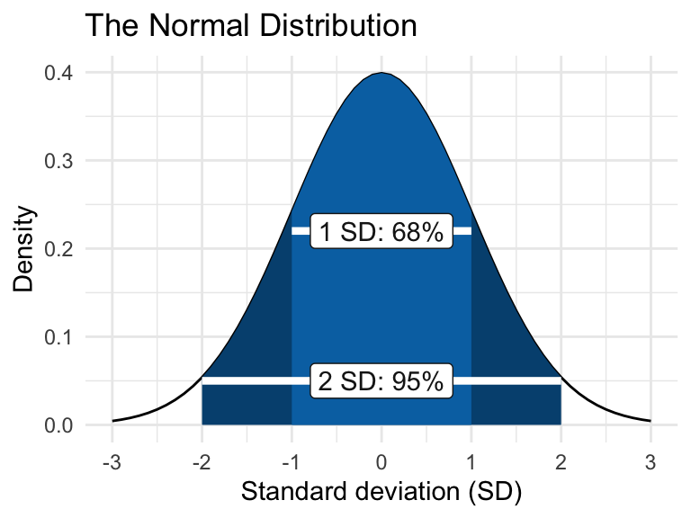
The normal distribution, also called the Gaussian distribution, is a symmetrical bell-shaped curve centered on the mean. It is characterized by two parameters: the mean (average) and the standard deviation (s.d.), which measures the spread of the data. Approximately 68% of observations fall within 1 s.d. of the mean, and 95% fall within 2 s.d..
We will use R to simulate some distributions, and explore these to get a feel for them.
R has functions for generating random numbers from different kinds of distributions. For example, the function rnorm will generate numbers from a normal distribution and rpois will generate numbers from a Poisson distribution.
10.3 Normal distribution
The rnorm function has three arguments. The first argument is simply the number of values you want to generate. Then, the second and third arguments specify the mean and standard deviation values of the distribution (i.e. where the distribution is centred and how spread out it is).
The following command will produce 6 numbers from a distribution with a mean value of 5 and a standard deviation of 2.
## [1] 0.8860899 5.9511727 0.4674129 6.2696362 3.0969106 5.3058671Try changing the values of the arguments to alter the number of values you generate, and to alter the mean and standard deviation.
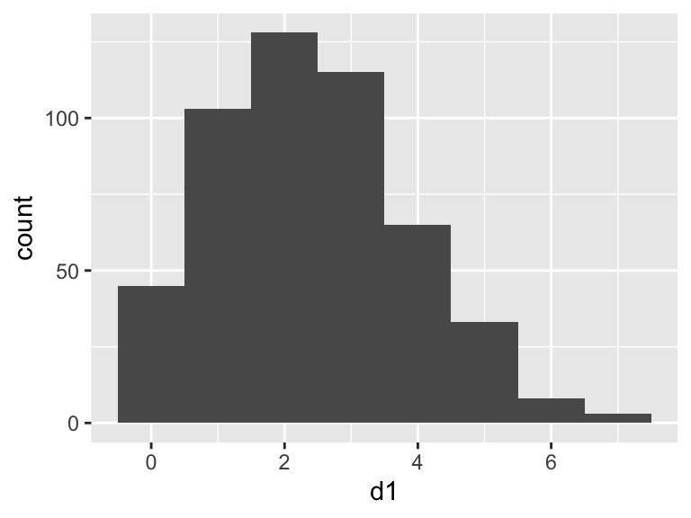
Let’s use this to generate a larger data frame, and then place markers for the various measures of “spread” onto a plot. Note that here I put a set of parentheses around the plot code to both display the result AND save the plot as an R object called p1
##        d1
##  Min.   :-0.9862
##  1st Qu.: 3.6789
##  Median : 4.9241
##  Mean   : 4.9399
##  3rd Qu.: 6.2712
##  Max.   :10.9317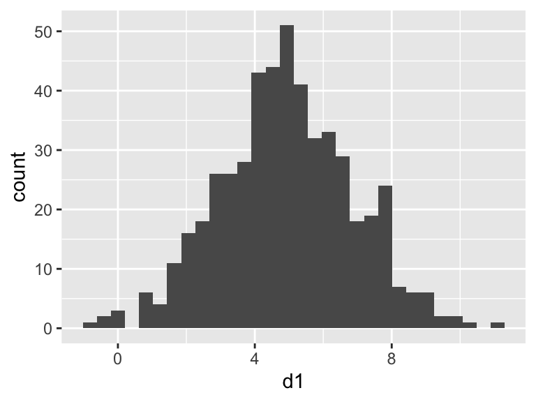
We can calculate the mean and standard deviation using summarise (along with other estimates of “spread”). The mean and standard deviation values will be close (but not identical) to the values you set when you generated the distribution.
Note that here I put a set of parentheses around the code to both display the result AND save the result in an object called sv
(sv <- rn %>%
  summarise(
    meanEst = mean(d1),
    sdEst = sd(d1),
    varEst = var(d1),
    semEst = sd(d1) / sqrt(n())
  )
)
## meanEst sdEst varEst semEst
## 1 4.939908 1.944357 3.780523 0.08695428Let’s use the function geom_vline to add some markers to the plot from above to show these values…
(p2 <- p1 +
  geom_vline(xintercept = sv$meanEst, linewidth = 2) + # mean
  geom_vline(xintercept = sv$meanEst + sv$sdEst, linewidth = 1) + # high
  geom_vline(xintercept = sv$meanEst - sv$sdEst, linewidth = 1) # low
)
## NULLWe can compare these with the true values (the values we set when we generated the data), by adding them to the plot in a different colour (mean=5, sd=2).
(p3 <- p2 +
  geom_vline(xintercept = 5, linewidth = 2, colour = "red") + # mean
  geom_vline(xintercept = 5 + 2, linewidth = 1, colour = "red") + # high
  geom_vline(xintercept = 5 - 2, linewidth = 1, colour = "red") # low
)
## NULLTry repeating these plots with data that has different sample sizes. For example, use sample sizes of 5000, 250, 100, 50, 10. What do you notice? You should notice that for smaller sample sizes, the true distribution is not captured very well.
When you calculate the mean and standard deviation, you are actually fitting a simple model: the mean and standard deviation are parameters of the model, which assumes that the data follow a normal distribution.
Try adding lines for the standard error of the mean to one of your histograms.
10.4 Comparing normal distributions
Because normal distributions all have the same shape, it can be hard to grasp the effect of changing the distribution’s parameters viewing them in isolation. In this section you will write some code to compare two normal distributions. This approach can be useful when considering whether a proposed experiment will successfully detect a difference between treatment groups. We’ll look at this topic, known as “power analysis”, in greater detail in a later class. For now we will simply use ggplot to get a better feel for the normal distribution.
Let’s use rnorm to generate a larger data frame with two sets of numbers from different distributions: (d1: mean = 5, sd = 2; d2: mean = 8, sd = 1).
##        d1                d2
##  Min.   :-0.9862   Min.   : 4.628
##  1st Qu.: 3.6789   1st Qu.: 7.305
##  Median : 4.9241   Median : 8.000
##  Mean   : 4.9399   Mean   : 7.978
##  3rd Qu.: 6.2712   3rd Qu.: 8.719
##  Max.   :10.9317   Max.   :11.495
The summaries (above) show that the mean and the width of the distributions vary, but we should always plot our data. So lets make a plot in ggplot. In the dataset I created I have the data arranged by columns side-by-side, but ggplot needs the values to be arranged in a single column, and the identifier of the sample ID in a second column. I can use the function pivot_longer to rearrange the data into the required format.
rn <- pivot_longer(rn,
  cols = c(d1, d2), names_to = "sampleID",
  values_to = "value"
) # rearrange data

# Plot histograms using "identity", and make them transparent
ggplot(rn, aes(x = value, fill = sampleID)) +
  geom_histogram(position = "identity", alpha = 0.5)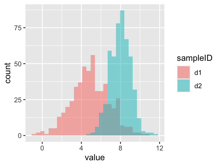
Try changing the distributions and re-plotting them (you can change the number of samples, the mean values and the standard deviations).
10.5 Poisson distribution
The Poisson distribution is typically used when dealing with count data. The values must be whole numbers (integers) and they cannot be negative. The shape of the distributions varies with the “lambda” parameter, which is the arithmetic mean of the distribution. Due to the zero bounds, small values of lambda will give more skewed distributions.
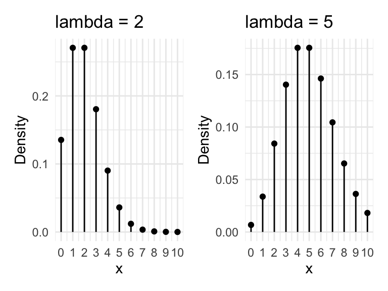
Let’s generate and plot some Poisson distributed data.
##        d1
##  Min.   :0.000
##  1st Qu.:1.000
##  Median :2.000
##  Mean   :2.396
##  3rd Qu.:3.000
##  Max.   :7.000
# Plot the data
(p1 <- ggplot(rp, aes(x = d1)) +
geom_histogram(binwidth = 1) # we know the bins will be 1
)
Try changing the value of lambda and look at how the shape changes.
Calculate the mean values and compare those with lambda
(they should be very similar).
Let’s calculate summary statistics of mean and standard deviation for this distribution
##   meanEst    sdEst
## 1   2.396 1.470888
Now lets plot the mean and the 2 times the standard deviation on the graph. Remember that for the normal distribution (above) that 95% of the data were within 2 times the standard deviation.
p1 +
  geom_vline(xintercept = sv$meanEst, linewidth = 2) +
  geom_vline(xintercept = sv$meanEst + 2 * sv$sdEst, linewidth = 1) +
  geom_vline(xintercept = sv$meanEst - 2 * sv$sdEst, linewidth = 1)
## NULLThis looks like a TERRIBLE fit: The mean is not close to the most common value in the data set and the lower limit of the standard deviation indicates we should expect some negative values - this is impossible for Poisson data. The reason for this is that mean and standard deviation, and therefore standard error, are intended for normally distributed data. When the data come from other distributions we must take another approach.
So how should we summarise this data?
One approach is to report the median as a measure of “central tendency” instead of the mean, and to report “quantiles” of the data along with the range (i.e. minimum and maximum). Quantiles are simply the cut points that divide the data into parts. For example, the 25% quantile is the point where (if the data were arranged in order) one quarter of the values would fall below; the 50% quantile would mark the middle of the data (= the median); the 75% quantile would be the point when three-quarters of the data are below. You can calculate those things using dplyr’s summarise. However, you can also simply use the base R summary command.
(sv <- rp %>%
  summarise(
    minVal = min(d1),
    q25 = quantile(d1, 0.25),
    med = median(d1),
    q75 = quantile(d1, 0.75),
    maxVal = max(d1)
  )
)
## minVal q25 med q75 maxVal
## 1 0 1 2 3 7## Min. 1st Qu. Median Mean 3rd Qu. Max.
## 0.000 1.000 2.000 2.396 3.000 7.00010.6 Comparing normal and Poisson distributions
To get a better feel for how these two distributions differ, lets use the same approach we used above to plot two distributions together.
##     normDist          poisDist
##  Min.   :-3.9862   Min.   :0.000
##  1st Qu.: 0.6789   1st Qu.:1.000
##  Median : 1.9241   Median :2.000
##  Mean   : 1.9399   Mean   :2.314
##  3rd Qu.: 3.2712   3rd Qu.:3.000
##  Max.   : 7.9317   Max.   :9.000
rn <- pivot_longer(rn,
cols = c(normDist, poisDist),
names_to = "sampleID", values_to = "value"
) # rearrange data
# Plot histograms using "identity", and make them transparent
ggplot(rn, aes(x = value, fill = sampleID)) +
geom_histogram(position = "identity", alpha = 0.5, binwidth = 1)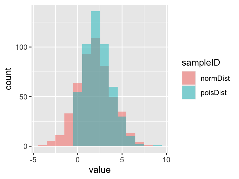
Try changing the arguments in the rnorm and
rpois commands to change the distributions.
Finally, let’s take another view of these data and look at them using box plots. Box plots are a handy alternative to histograms and many people prefer them.
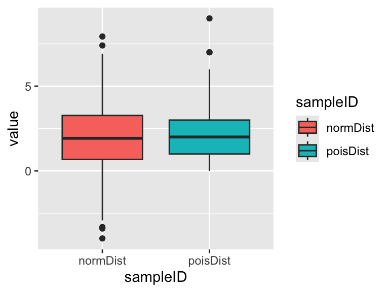
You should see the main features of both distributions are captured pretty well. The normal distribution is approximately symmetrical and the Poisson distribution is skewed (one whisker longer then the other) and cannot be <0. Which graph to you prefer? (there’s no right answer!)
10.7 The law of large numbers
The law of large numbers is one of the most important ideas in probability. It states that As sample grows large, the sample mean converges to the population mean. In other words, as sample size increases, you get a better idea what the true value of the mean is.
In this section you will demonstrate this law using coin tosses or dice throws. Since it is tiresome to toss coins hundreds of times it is convenient to simulate the data using R. Conceptually, what we are trying to do here is treat the dice rolling/coin tossing as experiments where the aim is to find the probability of getting a head/tail, or a particular number on the dice. It is useful to use dice and coins because we are pretty sure that we know what the “true” answer is: the probability of throwing a 1 on a fair dice is 1/6, while the probability of throwing a head/tail with a flipped coin is 0.5.
10.7.1 Coin flipping
Here’s how to simulate a coin toss in R.
## [1] "Tails"And here is how to simulate 6 coin tosses and make a table of the results. Note, we must use the replace = TRUE argument. Please ask if you don’t understand why this is necessary.
## result
## Heads Tails
##     4     2
We can “wrap” the table function with the as.data.frame to turn the data into a data frame that works with ggplot You’ll probably get different results than me because this is a random process:
result <- data.frame(result = sample(coinToss, 6, replace = TRUE))

ggplot(result, aes(x = result)) +
  geom_bar()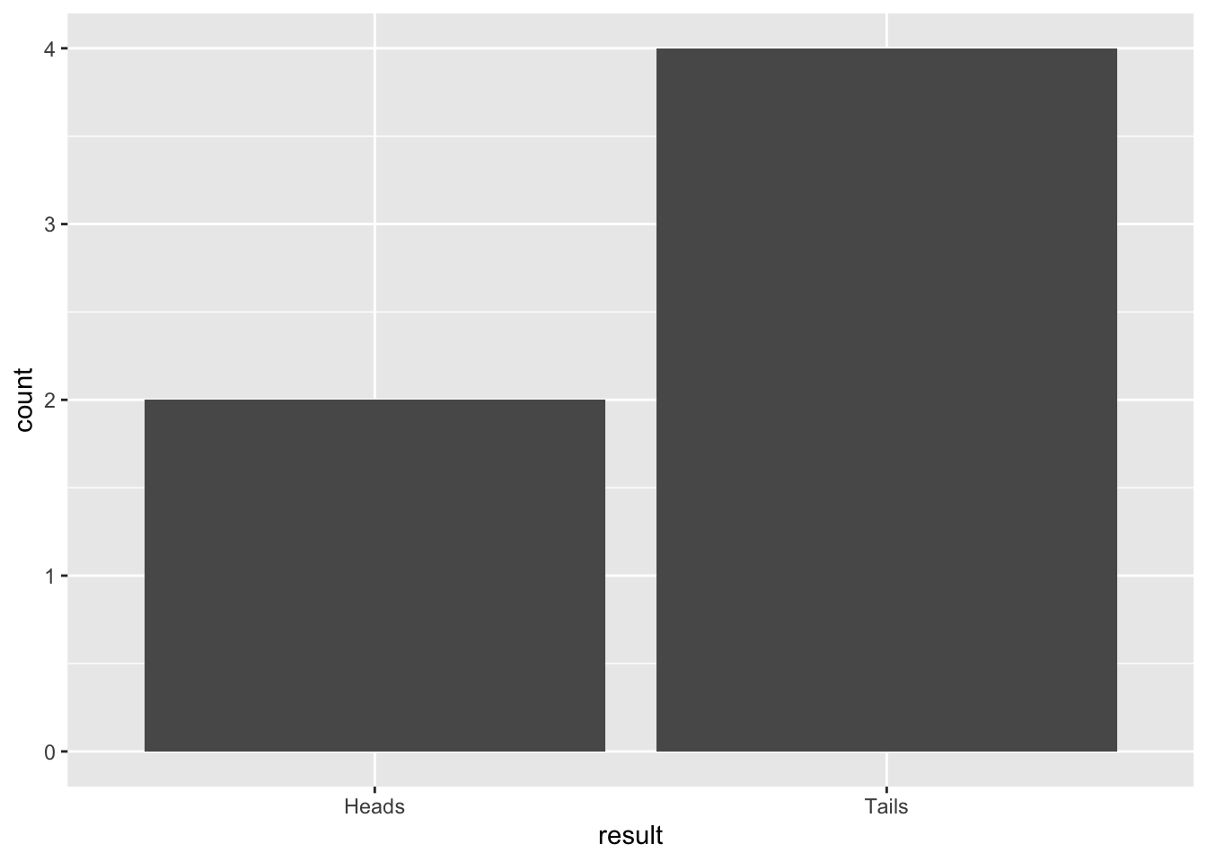
Figure 10.1: Barplot of 6 simulated coin tosses
Try this several times with small sample sizes (e.g. 4, 6, 8) and see what happens to the proportions of heads/tails. Think about what the expected outcome should be. What do you notice?
Now increase the sample size (e.g. to 20, 50, 100) and see what happens to the proportions of heads/tails. What do you notice?
10.8 Exercise: Virtual dice
Let’s try the same kind of thing with the roll of (virtual) dice.
Here’s how to do one roll of the dice:
[1] 3
Now it’s your turn…
Simulate 10 rolls of the dice, and make a table of results using R.
Now simulate 90 rolls of the dice. Put the results into a
data.frame(see the chapter An R refresher for help with this). Plot the results as a bar plot usinggeom_baringgplot. Add a line usinggeom_ablineto show the expected result based on what you know about probability.Try adjusting the code to simulate dice rolls with small (say, 30) and large (say, 600, or 6000, or 9000) samples. Observe what happens to the proportions, and compare them to the expected value. What does this tell you about the importance of sample size when trying to estimate real phenomena?